· 3 min read Posted by touchlab
Consistent Lighting in Material Design
Material Design uses the metaphors of digital paper and ink as a foundational principle. Structuring interfaces as if they were made of individual sheets of paper with ink printed onto them helps the user form mental models of how the interface works, where things are located, and what kinds of behaviors they can expect as they maneuver through an app.
To further help this model, UI elements can use “elevation” to show how close or far away they are from underlying layers like the canvas with elegant drop shadows.
It makes sense then that lighting should play an important role in thinking about your interface’s material design.
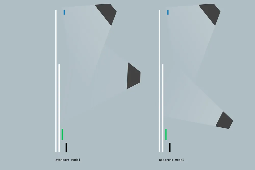
To keep the interface feeling “right” and consistent, it’s important to make sure that your lighting is consistent. Specifically, your interface should stick to Android’s default light sources unless you absolutely have to change them, or unless the default light sources may confuse the user’s mental model of how the interface is structured.
Take Android’s stock Dialer app for example:

Most of the app’s elements use Android’s built in elevation to cast shadows downward. This implies that the light is somewhere near the top of the device, tilted downward toward the display, at an indeterminate distance, with an “ambient light” centered on the screen. But on the dial screen’s bottom sheet we see a shadow going upward.
It’s tempting to add a shadow (or leave a shadow) on this element – after all, it’s a separate sheet of paper that slides up from the bottom of the screen, so we need to make sure it’s obviously discrete right? It’s worth asking whether the trade-off is worth it. On one hand it delineates the sheet, on the other, we can only see the top edge of the sheet, so it appears the sheet is lit from the bottom, inconsistent with normal lighting.

In reality, the sheet does have light cast on it from the main lighting source and ambient source in the standard model, we just can’t see most of it because the rest of the shadow would be cast beyond the edges of the device display. If we shrink the dial area a bit we could see those shadows.

But I would argue it isn’t necessary to change any UI elements just to show off their shadows.
There may be special cases (there always are) where a bottom sheet or other full-width element that touches the bottom of the screen may need special treatment to emphasize that it’s separate from the canvas sheet. My recommendation would be to avoid the temptation of inconsistent shadows, and mark with color, separate with thoughtful lines, or build the physical model of the interface with meaningful motion.
Plus, it’s way easier to just leave the shadows to the standard elevation. 😛