· 7 min read Posted by touchlab
Designing ClassPass for Android

In the late summer of 2015, touchlab began working with ClassPass, a service that gives users access to a huge network of fitness facilities for a monthly subscription.
Already popular on iOS, ClassPass wanted to bring its experience to Android so, in collaboration with ClassPass’ developers, touchlab took on its first design-only project and brought ClassPass to the material world on Android.
When we started out on the project, the ClassPass app could basically be split into two main functions: finding and signing up for classes, and managing classes you planned to attend or took interest in.
Both of these tenets were already solved for the iOS app, so in bringing the app to Android, the goal was to see how we could learn from the iOS experience to craft one that would work beautifully on Android. One that would feel comfortable for Android users, would offer the same functionality in a streamlined package, and innovate on both material design and the ClassPass experience.
As with any iOS-to-Android transition, we would keep ClassPass’ strongly developed branding – its color palette, typography, imagery, and voice would be faithfully maintained in the Android app, keeping it on-brand even as it made the jump to material.


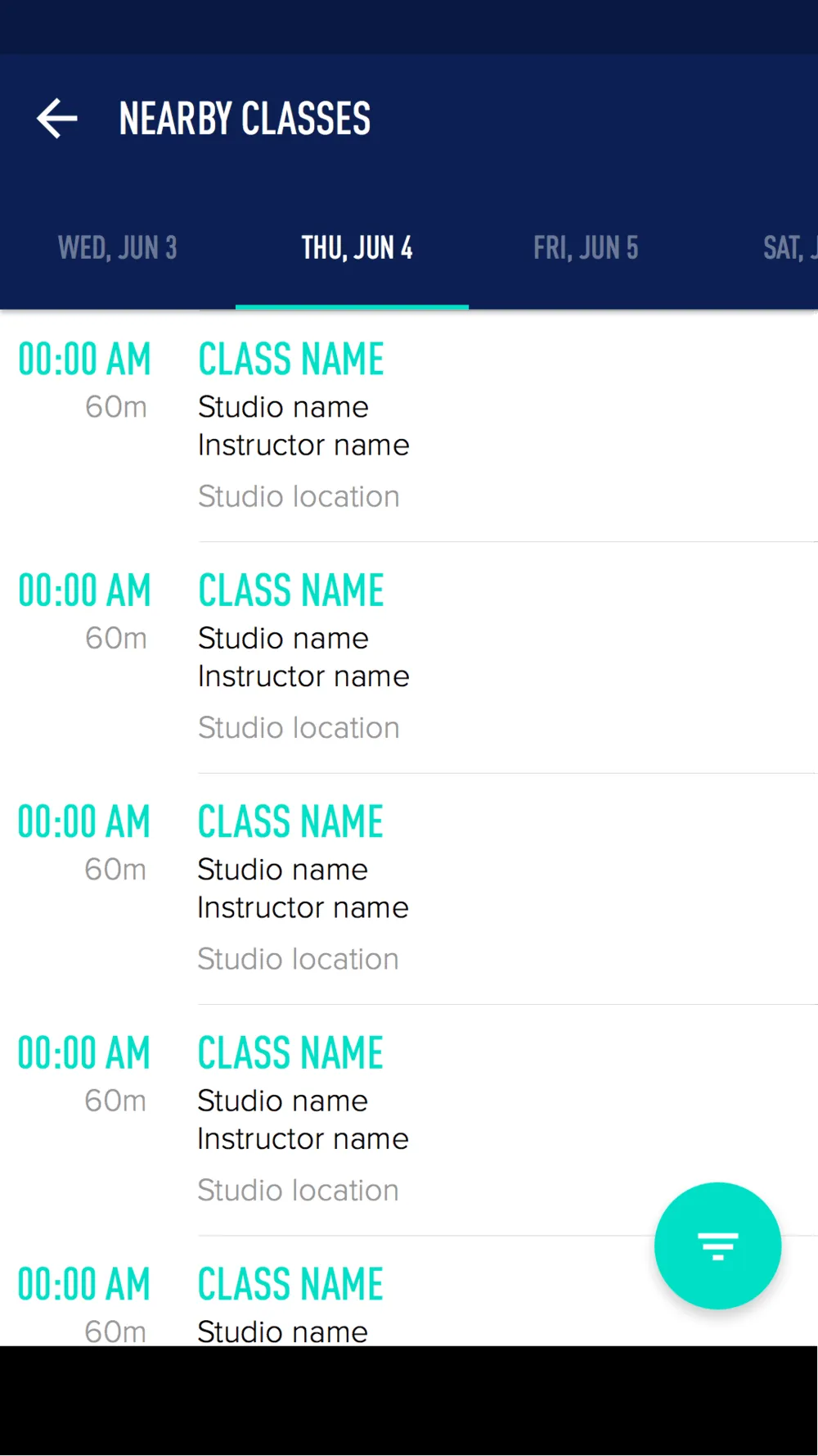
The first challenge we tackled was discovery – in other words, finding a class. On iOS, ClassPass offers a map and results view, with a toggle to switch between them. Search or filter results, combined with the user’s mapped position, will reflect on the list.
On Android, we recommended using the material metaphor to unite these two views into one seamless interface that gave users access to ClassPass’ deep architecture of Class and studio information in a light, welcoming interface.
The “main” map screen has a search bar with a filter action, and the bottom sheet houses relevant class information, starting with the user’s location and updating with filters, search terms, or specific selections.
The user can also pull the sheet up to reveal a full class schedule relevant to their results. As the sheet nears the top, it snaps up to the top of the screen by extending a toolbar. With a similar gesture, users can swipe the sheet down or simply touch the back button. And since the sheet covers the search bar, a FAB (floating action button) for filtering your results appears.
Over several motion sketches and prototypes, we landed on a great experience for this interaction: the user is in control of the sheet’s position as long as they are touching it, but when the finger leaves the material, the sheet – based on its location and velocity – decides whether to snap upward or downward.
The experience keeps the user immersed in the context of the map, avoiding any sudden context shifts, and allows for fast, free exploration.

The modular nature of the class results list also meant the list was flexible – ClassPass could “promote” tiles with background imagery or re-colored typography without substantively changing the experience.
The typography of the tile was obviously important too. In several rounds of revisions with the ClassPass team, we etched out exactly the right fonts, weights, colors, and placements to keep the information clear, readable, and hierarchically sensible.
So, what happens when the user touches that tile?


The class detail screen looks simple, but it actually houses a lot of information. It includes
- Class name
- Venue name and location
- Date and time
- “Favorite” action (that appears with a quick heartbeat animation)
- Amenities (things like lockers, parking, showers)
- Activities (what you’ll be doing in the class – like Yoga above)
- Class description
- What to bring
- Location
- Map snippet
- Link to venue profile
- Venue description
We had an opportunity here to condense the class detail screen and make it feel simple and light, without losing its bold, graphic nature. ClassPass has a library of venue-specific imagery at its disposal, so we wanted to keep that highlighted. Basic metadata that the user would want to see at a glance was overlaid on the imagery at the top of the page, and the “reserve” or “cancel” action was highlighted using a bold full-width button.
Rather than leaving amenities and activities as separate vertical sections, we condensed them into one scrolling row (inspired by Google’s Play Store) with a “chip” paradigm showing – with color and custom iconography – the supporting information relevant to the class. This area too is extensible – whether the class has 1 or 10 activities, the layout can accommodate without becoming too long.
 A previous revision of the class detail chips
Initially when considering the “chips” idea, we designed the chips with different colors for activities/categories, with one color for amenities. But keeping to the forward-looking extensible idea, it made more sense to use one color for activities and one for amenities, to keep things clearly organized for the user. If, in the future, there were 10 chips, the screen would be ready to accommodate them.
Next came a simple text layout for the description and “what to bring,” with the map, studio link, and description following at the bottom of the page.


Of course under every action, there are states to account for. The main action on the class detail screen is the class reservation button. A few things can happen when you press this button: your reservation is confirmed, your cancelation is confirmed, your reservation fails due to a system error, or your reservation fails because the class has already filled up.
Besides coloring the button to match reserved/unreserved states, we used Android’s light-weight “snack bar” element to communicate changes between states, coloring the bar as necessary to communicate success or failure.


After booking (and/or attending) some classes, the user can manage them through My ClassPass. This part of the app gives basic schedules for upcoming and past classes, and a more graphic “favorites” list that exposes favorite studios and that familiar bottom sheet for classes from those studios.
Beyond the bottom sheet, the modular tiles make another appearance, along with the full-width action button. By reusing paradigms like this across the app, we ensured that users would feel comfortable and confident throughout the experience, quickly and easily developing a mental model of how everything behaved.


Users can access My ClassPass (or the main screen) from the navigation drawer, which has space for future destinations in the app as well.
Making use of the paradigms from Google’s material design nav drawers, we designed the header as a dynamic area, serving information about the user’s class schedule. If there’s an upcoming class, the area is updated with relevant imagery and information, presented with the familiar typography found elsewhere.


There’s a lot that can be said for settings menus, but maybe not so much that should be said inside them.
The settings screen lets users manage an app – whether they’re updating information, changing options, or customizing their experience, the settings screens might seem like a very technical place. In reality they are, but the user doesn’t have to experience it that way.
Material design gives great guidance on settings in an effort to keep the overall experience similar between apps and between apps and the system overall. We used these paradigms to build the simplest, most organized settings experience possible, while staying true to the voice and feel of the broader app.
The full-width button makes another appearance as the “log out” button, and ClassPass’ signature typography and colors are applied to emphasize actions and hierarchies.
The takeaway from designing ClassPass for Android is the importance of extensible and reusable design elements.
Keeping things extensible and flexible is crucial for an app like ClassPass, which offers its services in multiple locations around the world.
Class schedules, availability, details, relevant filters, and other information changes from location to location, from day to day, so making something that looks and feels great no matter what the case was one of our main goals – and we pulled it off with material design 😉