· 3 min read Posted by touchlab
A New Visual Identity for Droidcon NYC 2016

In Winter/Spring 2016, I set out to create a new visual system for Droidcon NYC. The conference is moving to a new venue with a somewhat new format, and a renewed focus on including design in the lineup.
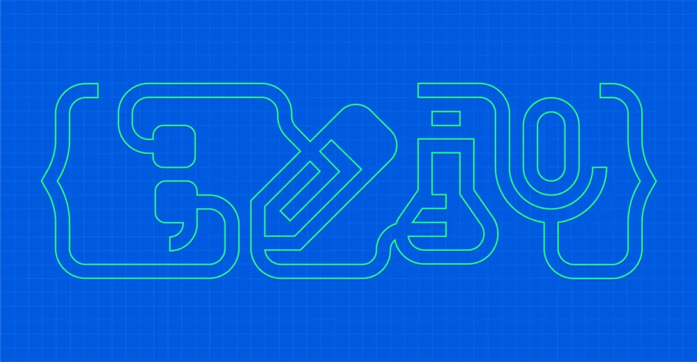
In rethinking the visual identity of Droidcon NYC, I wanted to come up with something flexible, modular, and extensible. It was that line of thinking that eventually lead to the pictographic system shown with its four primary glyphs above. The system is made of these individual icons which can mix and match together in different configurations to indicate the primary focuses of the conference.
Primary glyphs
There are four glyphs representing the themes of the conference, and two more primary glyphs created for promotion. Code, design, lab, and speaking are joined by “attend” and “sponsor” in the image below.

The glyphs are all based on the same grid, and follow the same pattern – all are surrounded by opening and closing “curly braces,” to which they connect through extensions of their core shape. The central groove of the pencil icon, for instance, connects to the top of the left brace, while the pencil itself draws a line to the right brace.
Working with a relatively small grid and heavy stroke imposed interesting challenges when designing the icons – each icon went through several iterations, sometimes changing form altogether, as was the case with the pencil icon which started off as an eyedropper. In this case I felt the measure marks combined with the eyedropper’s bulb made the shape too weighty. Changing that shape to an eraser, trimming off the extra lines, and adding a simple groove to the pencil gave me a much more cohesive-feeling icon that fit well with the others.

The beaker icon for “labs” likewise took a few tries to get right, slowly evolving into the icon above with just two focused smoke lines, and two measurement lines. No other floating elements were needed in the end. When initially working on the primary glyphs, I experimented with a staggered layout, but it ended up harming the superglyph, so I ultimately opted for a single-height standard.

All glyphs can appear solid or outlined, working for various contexts like session topics or even “idle” animations for displays inside the Droidcon venue.

Dual glyphs
Of course the glyphs come together to form the superglyph at the top of this post, but they can also combine in other ways.
Dual glyphs can connect to communicate session topics like “design lab,” or be used for other promotional materials to communicate ideas like “development speaker.”

And more…
We’ve just announced the dates for #DCNYC16, so the visual system will continue to reveal itself as we get closer to the conference. I’ll keep the post updated with a closer look at other assets like signage, badges, and way-finding as the date approaches 😁