· 8 min read Posted by touchlab
Designing ResearchStack's open source UX framework

In the fall of 2015, touchlab partnered with Cornell Tech and Open mHealth to bring precise medical research apps to Android with an open source sdk and ux framework called ResearchStack.
Executing this project would be unlike most projects – rather than designing one experience and interface for a single product, we would be designing and building an extensible framework, with designs covering many potential bits and pieces researchers and developers might need to carry out medical research on Android.
Beyond that, we would be designing and building an Android version of Mole Mapper, an existing ResearchKit™ app for iOS that helps users document and keep track of moles across their body, allowing them to share that information with their doctor and promote earlier detection of skin cancer.
So, how would we approach the UX framework? One of the primary goals (besides IRB approval) was to create an experience that was as easy and straightforward as possible but which also ensured that the user is – and remains – completely aware of how their data is managed and what information the apps collect.
The other major piece was creating something users would want to use to keep track of their health and participate in studies. Anecdotally, we learned that some researchers creating apps for ResearchKit had challenges with user retention. The real value of mobile research studies is in accessibility – if users can join a study and track their information easily, studies could operate with unprecedented sample sizes. That’s why we decided to tackle this problem head-on.
So with both of those goals in mind, the UIUX framework behind ResearchStack was broken into three main pieces – onboarding, dashboard and tasks, and data management and visualization. These three pieces would get the users smoothly into the app/study, make completing research and documentation tasks easy (and maybe even enjoyable), and make data clear for them and their care providers.
Onboarding
Pre-roll onboarding (or onboarding that has to happen before the user can open the app) is something that’s easy to get wrong, creating an experience that annoys the user or makes it feel like the barrier to entry is too high.
That said, a medical research app requires the user to be informed before joining, so the challenge here was to build out a process that felt light even though there could be as many as sixteen actions or more between the user and officially being part of the study. If the user doesn’t want to be part of the study, there is an affordance for simply using the app to keep track of their own information.
The onboarding is itself broken into three pieces.

First, eligibility. Is the user actually eligible to join the study? This step uses general qualifying questions to determine if a user is eligible to participate in the study. Like the rest of the onboarding process, the interface is minimal by design. Question layouts and list controls are predictable and uniform, with a high contrast color palette of just white, gray, and blue to visibly highlight questions, selections, and progressive actions.
Next is consent. The user needs to have a clear picture of what the study entails, the purpose of the app, and the fact that they can leave the study at any time. Besides providing this information to the user with illustrations, videos, or links to further reading, the consent process can ensure the user is truly informed by requiring a brief quiz covering the preceding information.

The quiz steps maintain the predictable question layouts from before, but are more dynamic. After a user submits their answer, a message will tell the user whether they are correct or not, highlighting both the user answer and the correct answer, and providing an explanation when needed.
The bottom action bar in this case is also dynamic – if the user needs to read an explanation about the answer that extends off-canvas, the “NEXT” button transforms to “MORE,” and – when touched – scrolls the text progressively until the end, when the user can finally touch “NEXT.”
The same mechanic is used at the end of the quiz when the user finds out whether they passed the quiz. Answers are explained one more time, and the user can go back to give it another try.
Once the user is fully informed and ready to join the study, they need to register and create an account. We designed a flow that allows the user to sign up, enter personal info, and create a secure passcode to encrypt their data, even if they exit the app during signup and then come back.

Dashboard & tasks
Inside a research app, we wanted to create some UX definitions for at least two primary goals – study participation through “tasks,” and the visualization of data for the user and their care providers.
Most basic tasks come in the form of surveys or measurements. These kinds of tasks rely on the same predictable question layouts mentioned above, but tasks can contain various types of questions and inputs, either on the same screen or on multiple sequential screens. So we came up with designs that allow for this kind of modular assembly of tasks.
Apps like Mole Mapper make use of these patterns too, even while simultaneously including tasks requiring more unique interactions like using the camera and visually measuring objects.

Tasks, in the framework design, are managed on one half of the dashboard interface. They appear as a list of items that can show visual categorization with colored indicators. In most cases, completed tasks will slide to the bottom of the list for a given day, and previous days’ responses can be found in a chronological timeline below that.
But this dynamic can change, even within the visual definitions we provided. For example, Mole Mapper’s tasks are simply divided into two subheads – to-do and done. Since Mole Mapper works on a monthly cycle and previous mole measurements are stored in an interface that visually connects them to the moles, there’s no reason to keep duplicate entries in a chronological timeline on the main interface.

As explained before, keeping users engaged and participating is tough. Part of this is ensuring that participants complete their tasks to create full data sets. To try and encourage participation, we made creative use of visual cues to get users back into the task list until all the tasks are done.
In the tab bar, the task icon or text label will be badged with a small circle to indicate some unfinished business. If the user is still ignoring that and looks into their data dashboard, visual cues will prompt them to “FINISH” tasks, with the button simply leading back again to the task list.

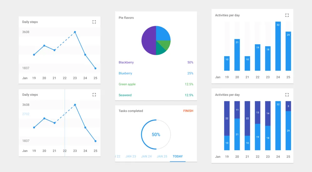
Data management & visualization
Designing charts and graphs is and was a pleasure. Data visualization is a rewarding exercise, offering the chance to design something that looks deceptively smooth for how rigid the underlying data are.
For the initial release of the open source framework, we designed several kinds of visualizations, from a basic pie chart to interactive line graphs and multivariate bar charts.

The same reduced palette as before allowed us a lot of freedom to clearly communicate information and add new colors to the palette for multiple variables as needed. Keeping things minimal meant we had plenty of room to add new touches of information.
And as always, one of the goals of the design was to create something predictable for the user that would easily and quickly build a mental model of how data visualizations worked and what they meant. Consistent “expand” icons allow users to see larger views of their information, cards can be arranged in any order and still appear familiar, and clear headers and labeling explain everything.

On the management side of data, we wanted to make sure the user always had options to manage their data and participation status. Persistent action icons in the app’s toolbar provide access to information about the study and settings around data sharing, consent, security, and study participation. If the user wants to learn more, stop sharing, or even leave the study, it’s only a tap away.

Conclusion
Extensible design is a recurring theme in our work, and nowhere does it better shine than an open-source UX framework.
The design of ResearchStack’s framework is one that allows for easy customization and organization without losing the hallmarks that make it easy for users to get started and stay engaged.
Simple palettes, clear and predictable layouts, and a visual hierarchy that doesn’t get in the way of unique and diverse interactions come together to lay a foundation for designing precise medical research apps for Android.