· 12 min read Posted by Frances
A Multiplatform Case Study for an Inclusive Virtual Try-on Experience
Getting Started:
At Touchlab, it is typical for us to take on leads and projects that are new to us. We’ve worked on hardware, watch faces- all kinds of things- with no previous experience; we embrace the challenge and rise to it. It is atypical, however, for client research to blossom into a philosophical, platform agnostic, week-long design sprint.
But, we are nerds.
It all started as a simple conversation with people in the retail cosmetics industry. First, we noticed how fun it was to take virtual selfies with funky eyeshadows. Then, we noticed that some virtual try-on apps were waaay better than others. Finally, we got feisty (and immensely curious) when two makeup apps failed to recognize Jeff’s face correctly.
Not quite.
We saw value in spending time to develop a deeper understanding of the virtual try-on world- really to foster our own awareness of what it takes to accomplish inclusive and feasible design in this space.
Our goal? To design a user-centric, e-commerce experience for a single makeup brand in one week.
Cultivating Empathy and Acknowledging Context:
When it comes to people who wear makeup, you cannot generalize into one or two flattened personas; anyone can wear makeup and the reasons behind applying even a simple black eyeliner are fluid and highly subjective.
Matching eyebrows to lids: the things we notice now. More from Ziggy here:
As Nielsen puts it in the 2018 Future of Beauty Report, “There is no one beauty shopper.” It is also important to note that wearing makeup — be it skin tone or neon green — is less related to confidence, vanity, conformity or belonging than some might think.
For most, it is a form a self-care and for many, a creative and even artistic expression of Self. This is how we are approaching makeup during this design sprint.
(By the way, if you didn’t already know, the biggest makeup trend in 2019 is gender fluidity.)
This idea of makeup as a form of expression is by no means new. But culturally and technologically, the beauty industry must embrace/is embracing the “no rules” approach as social boundaries are broken, social media influences the path-to-purchase and buyers across industries begin to trust and expect VR offerings.
Our Discovery Process:
Armed with what we feel is a grounding contextual view of the modernizing makeup industry, Touchlab’s design team kicked off a more hands-on discovery process by conducting a contextual inquiry and investigation through many of Manhattan’s makeup stores.
Why? In order to get off of our laptops and challenge any preconceived assumptions about makeup shoppers IRL. 🕵🏻♀️ 🕵🏻
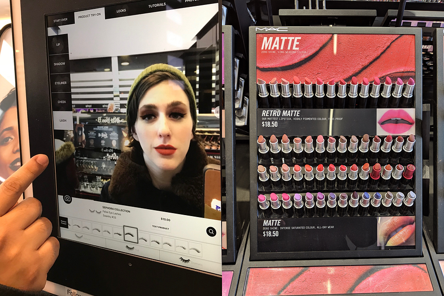 Left: Sephora’s virtual try on installation. Right: An example of MAC’s in-store product organization.
As we made our way around the different retailers, four interactions stick out:
- Quiet 20-somethings experiment with every bright-blue lipstick in the store. The makeup artists were kind and attentive, but let everyone play around with bold blues and shiny reds unbothered. Everyone was rubbing makeup on, wiping it off, checking themselves out, asking questions. Allowing and encouraging customers to play creates a positive retail environment and a magnetic vibe.
- A seasoned makeup artist explains their goals for their popular youtube channel; to target people who are “going somewhere” and do memorable street makeovers to match expectations around that experience.
- An older woman’s experience at an in-store virtual installation is somewhat marred by a technical gaffe; her virtual lipstick is overtly offset from her actual lips, seemingly because of her wrinkles. Despite this error, she expressed how fun it was and stayed for over 15 minutes.
- Two girls hesitate at the door of the store that seems a bit, well, “stuffy.” They leave almost immediately.
Amongst the perfumed chaos of the wildly different retail environments, we do detect an overarching trend: all kinds of people want to play and experiment with fun makeup, no matter their intention to buy.
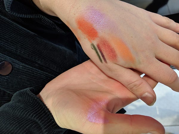
Trying on different shades on your hands is commonplace in stores. Virtual try-on certainly solves this “pain point.” (Is it a pain point?)
User Testing and Product Audits
We moved into user testing and product audits of the more popular virtual makeup apps, the goal: to test not only the usability of these virtual experiences but also people’s reactions to e-commerce-oriented flows versus more playful user flows.
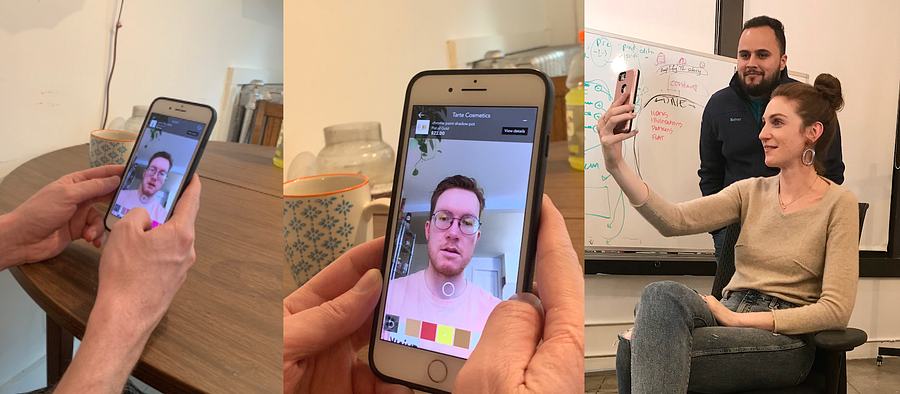
We tested the most popular apps in both the App Store and Google Play. The reactions were emotionally loaded. Most reacted negatively to commerce-oriented user flows that sent them back and forth between traditional, scrollable product grids and the virtual try on camera. Some had trouble even finding the virtual try-on feature on many apps.
Memorable quotes include:
“I don’t even know what this picture means. How do I even get to the try-on? I feel like it’s trying to just sell me *things*.”
“Where are my lipstick colors even going after I try them?”
“Wait! I wanted to see the whole look!”
However, we observed that users had the most fun when playing with colors as a form of self-expression:
“Dang, I look good. 👩🎤
“I’m going to go with… this color — “Dangerous” — because that’s how I feel.”

Danger is a pretty cool middle name.
Defining our Scope:
Surfacing from our deep immersion into virtual-try on make-up apps proved rather difficult for us designers; we are both now addicted to makeup apps and were getting pretty good at selfies. 🤳🤳🤳👩🎨 👨🎨
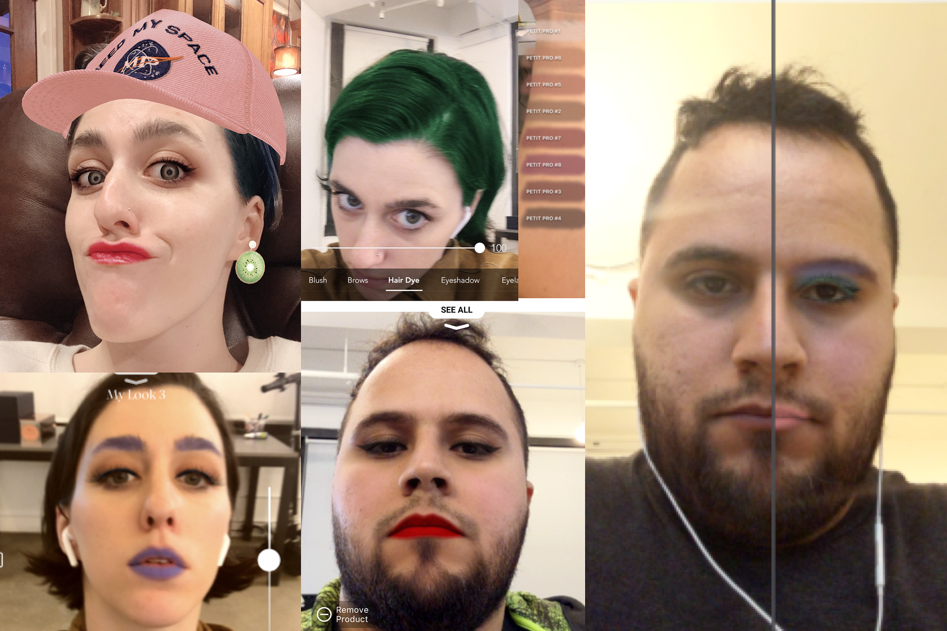
Touchlab Designers conducting product audits WHILE looking really, really good. If we do say so ourselves.
It was time to start taking our data and synthesizing it into actionable points of departure. Harnessing the passion of the makeup-wearers we interviewed and observed, we constructed a persona spectrum.
“Instead of defining one character, persona spectrums focus our attention on a range of customer motivations, contexts, abilities, and circumstances.” — Margeret P. for Microsoft Design (More here)
We know from our process of empathetic understanding that customer motivations for trying on makeup virtually vary greatly, but an overarching motivation might best be called “play”- with an underlying asterisk: ***”play” without the blight of glaring technical virtual misunderstandings for which a modern user has little tolerance.
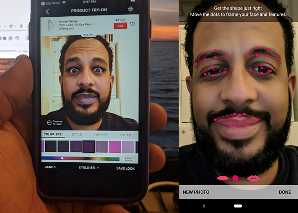
 Left: virtual try on of lipstick. Right: IRL photo of that same lipstick. I would (and did) buy this in-store, but not online. Not all virtual makeup was as inaccurate.
We are moving forward with the assumption that users are less likely to buy a makeup product (in-app or in-store) if they do not trust the accuracy of the application of the virtual makeup. We define “Accuracy” here as the belief that the product will look, in real life, just as it does on camera. Accuracy, then, is relative to the proper recognition of the user’s facial features, skin tone, race, age, etc.
 Brainstorming at the office. #nomakeup #nofilter
From user testing sessions, we gathered that users of virtual try-on experiences want:
- A balance of “Play” and “Pay” (Allowing product exploration and experimentation to be the natural point of sale, similar to the in-store experience. )
- A means for creative expression with makeup
- A variety of products to try
- Accuracy in the virtual try-on experience. (Where product accuracy cannot be achieved, at least a positive, fun experience can funnel users in-store.)
Users of virtual try-on experiences need:
- Easy control of the camera view with one hand/thumb
- Proper architecture and timing of e-commerce product areas during the play to pay funnel.
- A well-lit camera view, flexible enough for a myriad of environments
- A natural multi-platform user experience
- Facial Recognition for all genders, ages, and races*
*Feasibility-wise, this is an idealistic thought summarily strangled by the inequity in facial recognition we’ve witnessed thus far in our research. The feasibility of speedy and comprehensive machine learning for all faces will come from developers out there; as designers, we feel it is important for us to engage in the conversation and point out the inequity. Idealistic? Yes. Nonetheless, an underlying need.
With our user-centric motivations in mind, as well as recognition of the strengths and shortcomings of existing products- we arrived at our goal:
Create a modern, e-commerce, camera-focused experience that feels seamless and authentic.
Ideation meets its frenemy- Feasibility:
With our guiding principles in mind, we asked ourselves: How do we harness existing powerful API’s and a cultural affinity towards dramatic and playful makeup to create a delightful and inclusive e-commerce experience?
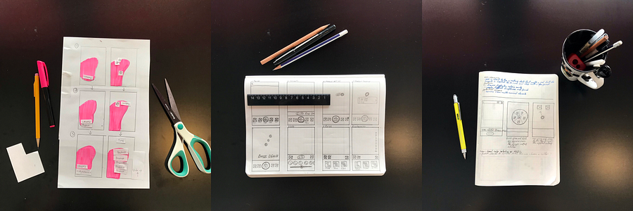 ~ Low Fidelity Ideation Techniques including sketches and thumb maps ~ AKA Paper!
For the ideation process, we considered both constraint and context, respectively restricting and potentially accrediting features down the road. Constraints become especially important here when dealing with a camera/virtual experience:
For instance, design-wise, we must consider the one-handed “thumb zone.” and commonplace user experiences and, related, expectations around popular camera-oriented apps.
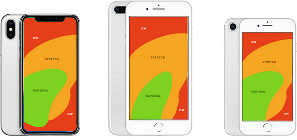
More about Scott Hurff’s thumb zone here. Note that these photos reflect right-handed thumb zones.
Feasibility-wise, we must remember:
- Our sprint time constraint 👮🏼♀️
- The importance of an e-commerce funnel
- The availability and robustness of cosmetic API’s
- The machine learning curve of accurate makeup application for the whole spectrum of race, gender, and age.
Some of the contextual circumstances that we considered include:
- Physical limitations, temporary or permanent. (We are, after all, asking the user to take a selfie and therefore should absolutely keep the one-handed experience in mind.)
- Users with the inability to deeply focus on the task at hand- be it temporarily due to various forms of distraction, or permanently, perhaps due to disability.
- A range of environmental lighting and how that might influence virtual quality and accuracy
Scoping in, “Must Have”, feasible features include:
- Ability to save looks/products for later
- A predominantly camera view
- Cart / Wearing list
- Guided process
- Color picker
- Control over makeup intensity
- Adding to bag
- Seeing Makeup Details
- Easily Changing/Removing/Adding Products
Features that we should or could have:
- Automatic camera light correction
- The ability to report or fix incorrect virtual makeup application
- Saved “Looks” that apply all at once
- The ability to share
How exactly those retail elements are presented was guided by user reaction and also screen space available, considering that we don’t want to cover the users’ face with text during their selfie session.
Design Progression:
Because of the e-commerce element of this project, we needed to test when, where and how to show the user the product information sooner rather than later. We started off by letting them play first, then show them their choices in a cart-like setting after the fact.
Even though the process to get to the cart did not take long, users rejected being in the dark; they wanted to know exactly what they are wearing when they were wearing it.
Mid-fidelity prototyping identified weak spots in both visual hierarchy and the timing of e-commerce introduction as we strove to balance UI and branding with the selfie-camera view.
During our iterative process, we determined what we think is the most natural way to introduce e-commerce elements into a playful virtual experience using thoughtful choice architecture:
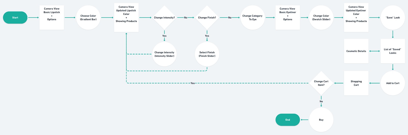
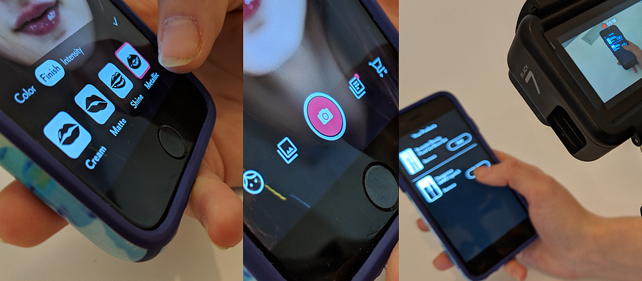
For lipstick application, for instance, you first narrow the product areas by color-which is easily changed-, then choose the preferred finish (and thereby the exact product line and color), and then finalize with manipulation of the intensity of the makeup application.
For brows, however, you should first choose what type of application method you prefer, then choose between the few colors that are offered (thereby the exact product line and color), and then select the “style” (which is where things get fun again, for the user).
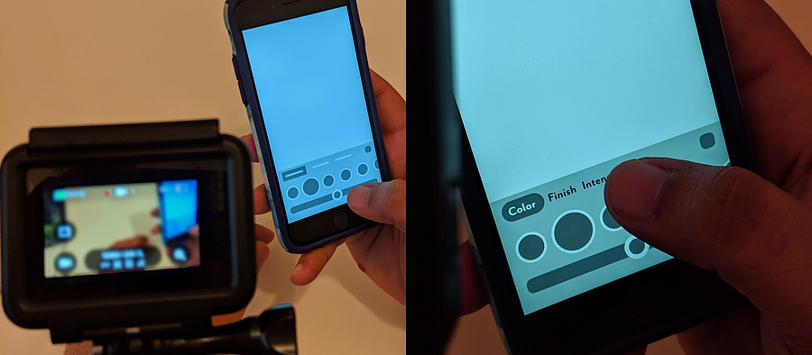
 Hi-fi prototyping with re-architecture of e-commerce details
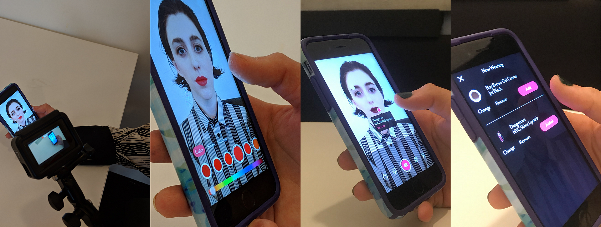
In our “final” prototype, we wanted to reflect a selfie-focused experience that encourages the user play with products without feeling forced to buy those products.
In order to do so, we introduced the product description as a minimalistic, clickable overlay at what users deemed an appropriate time- and added the ability to change the products that the user is wearing from a “now wearing” list.
This person has opened a virtual makeup app, they want to try on makeup, they want to have fun, they want to see the price of the makeup, and ultimately, they just might buy something that they like.
The takeaway from designing this sprint for multiplatform is the importance of maintaining a human-centric approach so that when we pass off to developers, they understand our thoughts on tackling feasibility in this space.
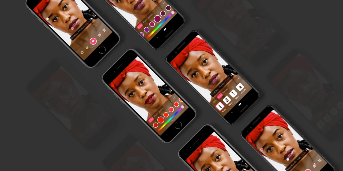
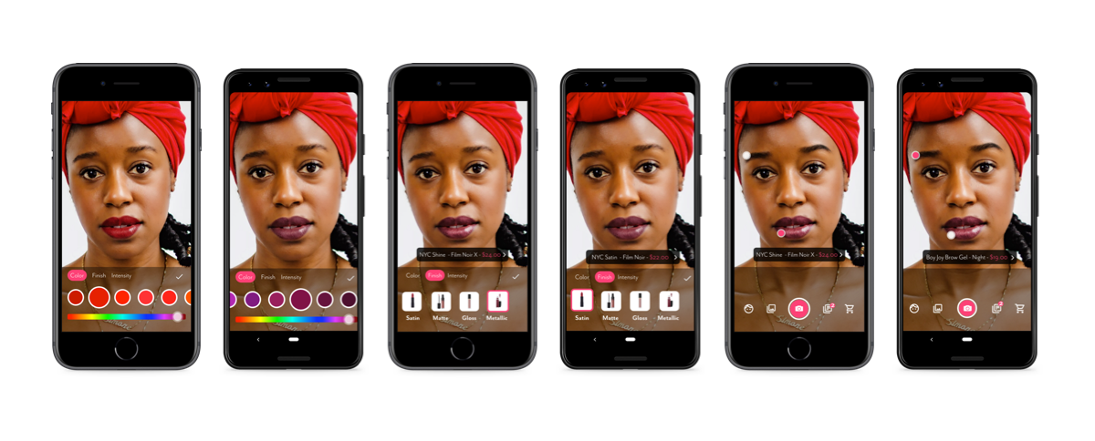 “Final” prototype for both iPhone 8 and Pixel 3
A note on prototyping:
Because of our one-week time limit, we decided against framer and instead chose to work with still images to imitate a live camera view. A natural next best option would have been to use Sketch, but keeping in mind that early concepts need iteration to happen fast we decided to use Adobe XD.
XD allowed us to change and test things between and across the team quickly and efficiently. Additionally, the lack of an app for previewing Sketch files on Android was a deal breaker.
XD’s auto-animate unlocked effortless micro-interactions on the final prototype that gave it an extra layer of realism; this was absolutely key in our virtual + selfie experience.
Ending Thoughts:
If you have read anything about Touchlab recently (see this post about our recent announcement with Square!) you have probably picked up that we are proponents of multiplatform design and development.
In this sprint, we forego assumptions about the differences between iOS and Android users and instead design for our spectrum.
Does it matter if iOS users “spend more money on makeup products” or if Android users “take fewer selfies”? Defining a person (or persona) by the phone that they buy seems silly and too blanketed.
As the industry of mobile development moves to a future where iOS and Android Engineers are becoming Mobile Engineers, our design team becomes Mobile Designers.
We focus on expressing our client’s brands across platforms the right way, instead of focusing on items on a list.
Frances Biedenharn & Nelmer De La Cruz
Our philosophy is to step back from “I’m an iOS designer. I’m an Android designer” and instead advocate for experience designers that understand the possibilities and constraints of each platform.