· 8 min read Posted by Kevin Schildhorn
Adaptive Layouts in Compose Multiplatform

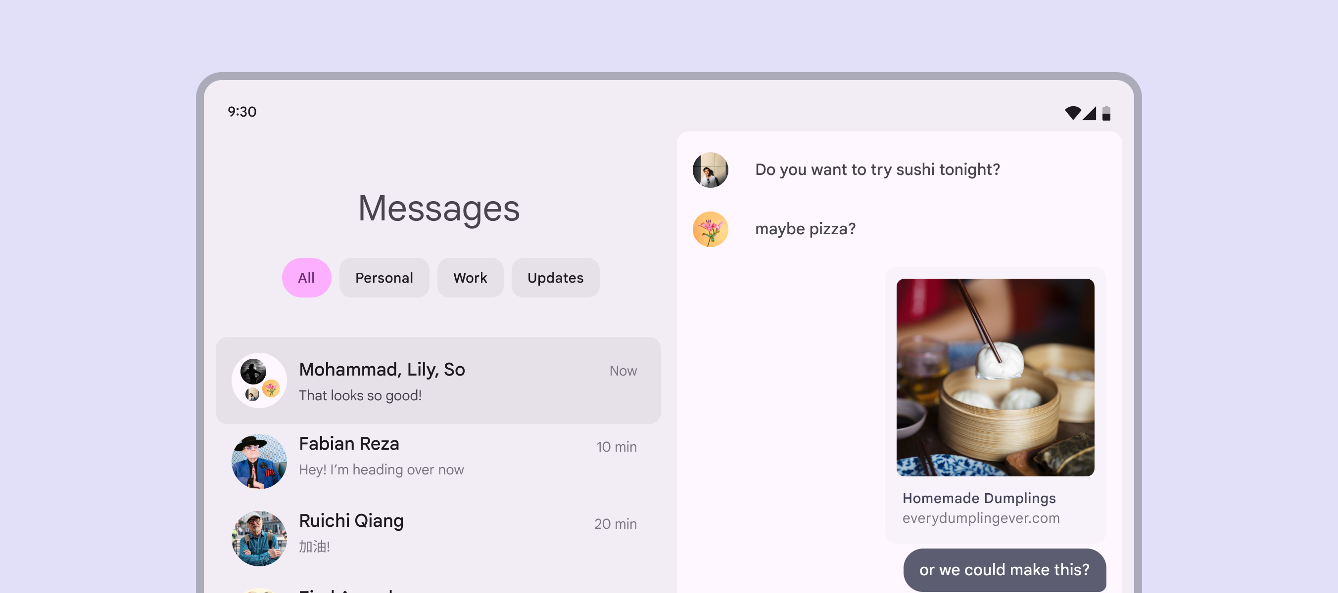
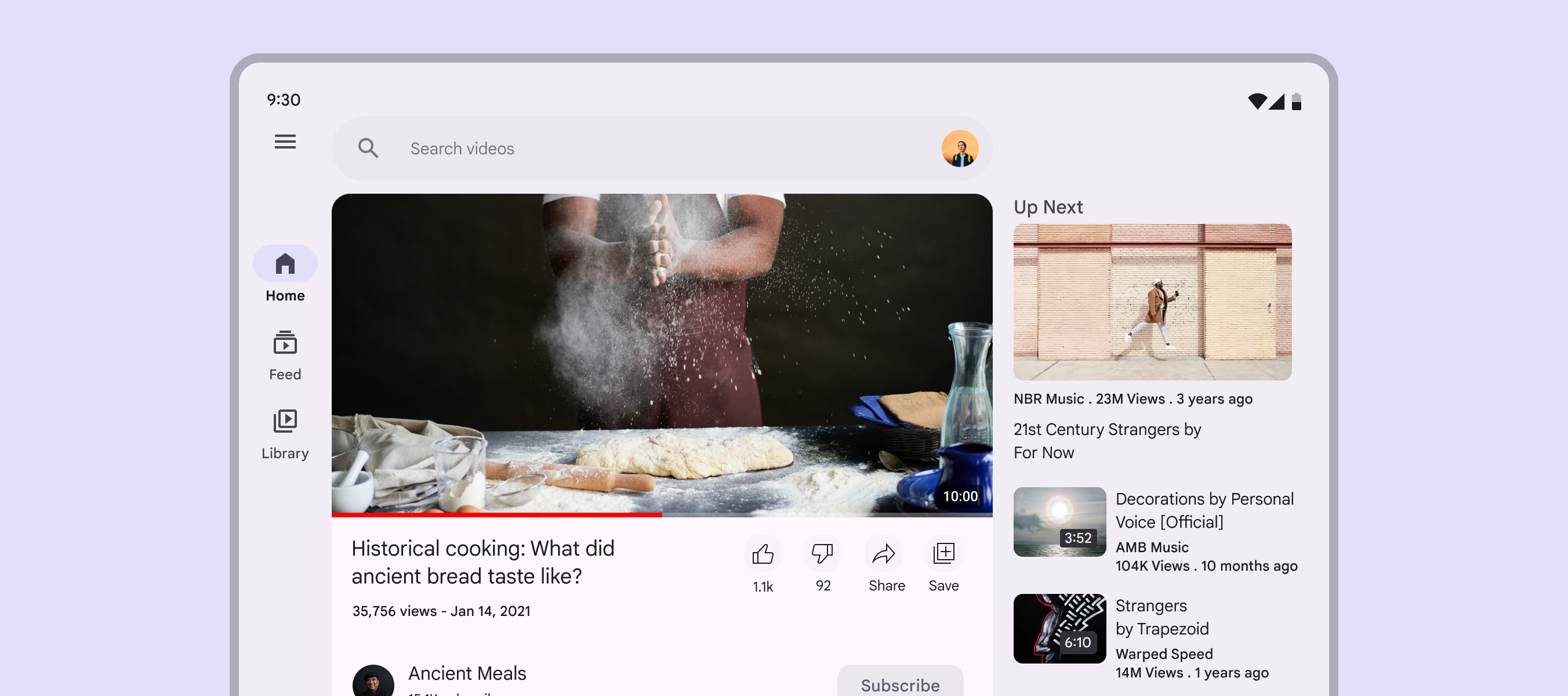
A couple of months ago the 1.0 version of adaptive layouts API was released for Android, allowing your app’s UI to adapt to different display sizes and configurations (including rotation changes). This contained a navigation suite as well as two Canonical layouts, defined as multi-pane scaffolds: ListDetailPaneScaffold and SupportingPaneScaffold.
 |  |
|---|
These two scaffolds support different adaptive layouts that can adjust to different Android screens such as phones, foldables and tablets. This means you can share your screens UI between different form factors while still making the most of the screen space.
When Compose Multiplatform 1.7.1 was released, it included adaptive layouts. This means adaptive layouts are now available for Android, iOS, Desktop, and Web. So how does it work? This post will go into how canonical layouts are implemented, how well it works with each platforms, and how it differs from the AndroidX API..
A Feed layout is also mentioned in the adaptive layout API, however it won’t be covered in this post because it’s implemented using LazyGrids and not a new composable.
Navigation
 |  |
|---|
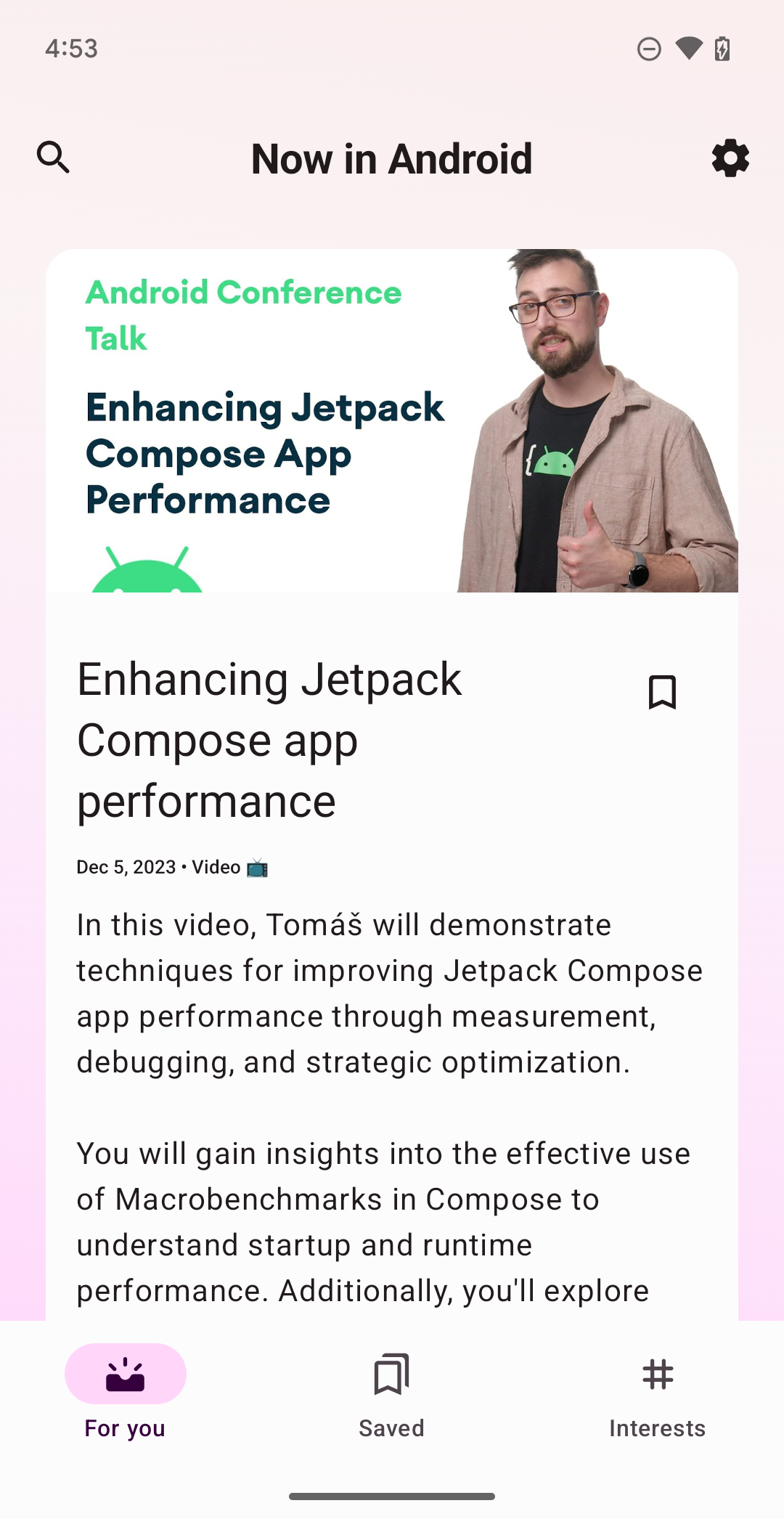
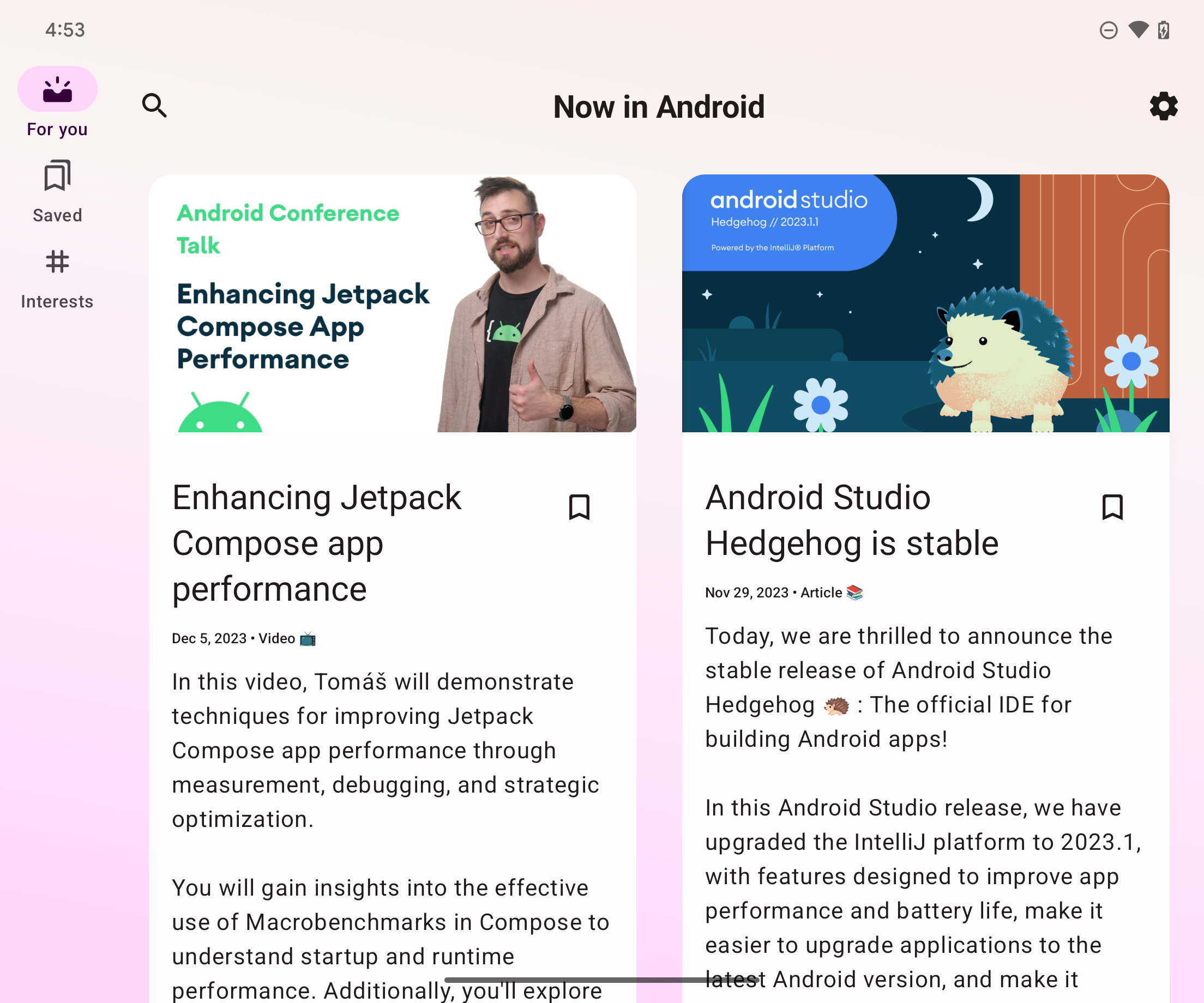
First off, before we get to the layouts it’s important to mention navigation. You want top level navigation with adaptive layouts, which can be achieved using BottomNavigation for smaller screens and a NavigationRail for larger screens. In Android there is even a NavigationSuiteScaffold based on the WindowSizeClass, unfortunately this isn’t available in Compose Multiplatform yet.
This means that we’ll have to handle the navigation element ourselves.
val activity: Activity
val windowSizeClass = calculateWindowSizeClass(activity)
val useNavRail = windowSizeClass.widthSizeClass >= WindowWidthSizeClass.Medium
when using the WindowSizeClass we can check the current size of the window.
There are three window sizes: Compact, Medium, and Expanded.
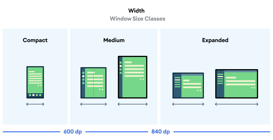
With this we can see if we want to add the NavigationRail or the BottomNavigation, or we can even add separate logic for all three window sizes if we want.
From there we can add an if/else check and apply different composables based on the size:
if (useNavRail) {
    Row(horizontalArrangement = Arrangement.Center) {
        NavigationRail(windowInsets = NavigationRailDefaults.windowInsets) {
            Spacer(Modifier.weight(1f))
            destinations.forEach { item ->
                NavigationRailItem(...)
            }
            Spacer(Modifier.weight(1f))
        }
        YourCommonAdaptiveLayout()
    }
}
else {
    Column(verticalArrangement = Arrangement.Bottom) {
        BottomNavigation {
            Spacer(Modifier.weight(1f))
            destinations.forEach { item ->
                BottomNavigationItem(...)
            }
            Spacer(Modifier.weight(1f))
        }
        YourCommonAdaptiveLayout()
    }
}

@Composable
private fun YourCommonAdaptiveLayout(){ ... }
Be sure to move your adaptive layout code out of the if/else, because the whole point is to share the layout!
List Detail
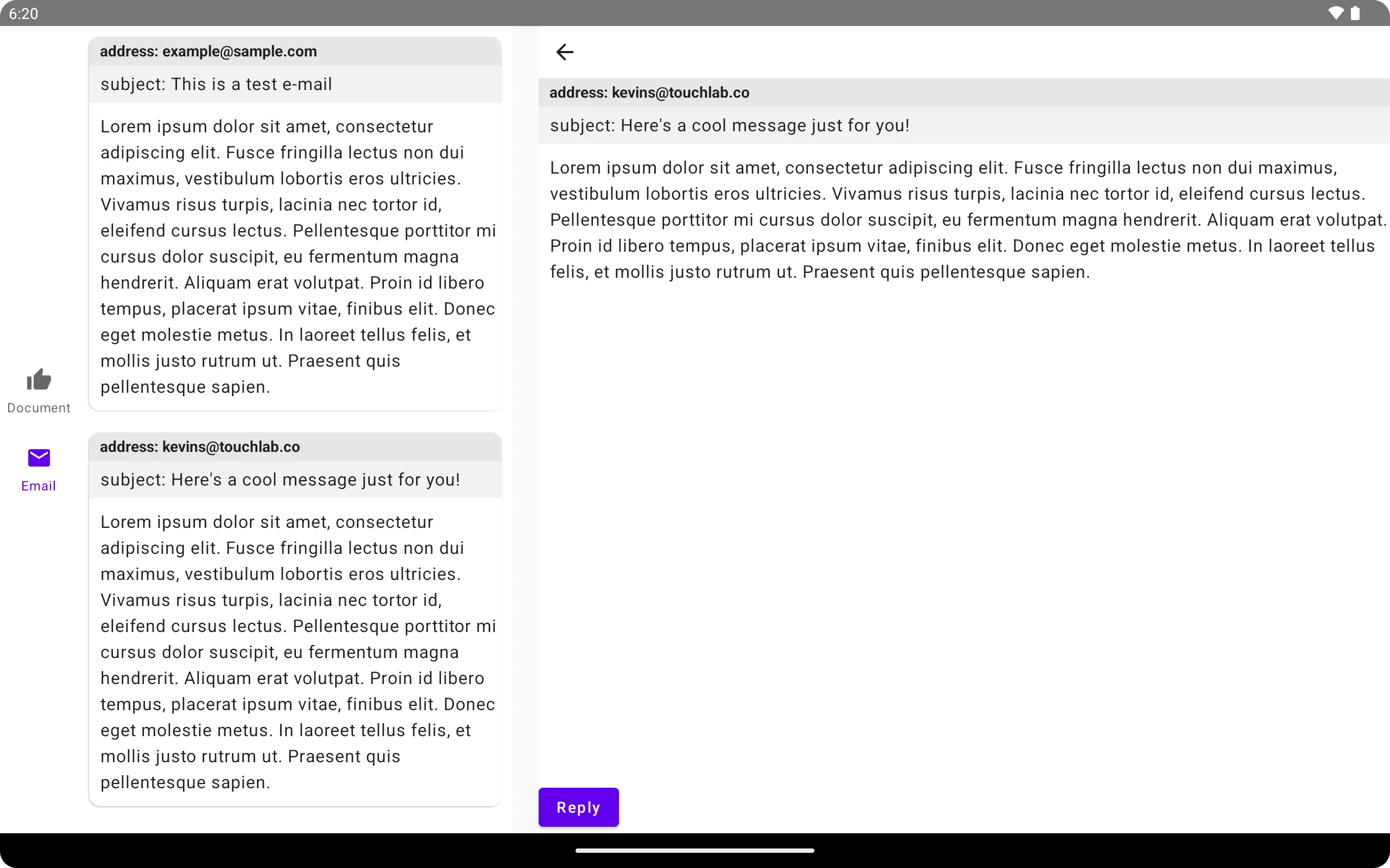 With the navigation out of the way we can try out the first canonical layout, list detail.
 ListDetailPaneScaffold can be used to show up to three composable panes: listPane, detailPane and extraPane.
The API for ListDetailPaneScaffold slightly differs between AndroidX and CMP, mostly that the AndroidX API has some extra variables that aren’t in the CMP API.
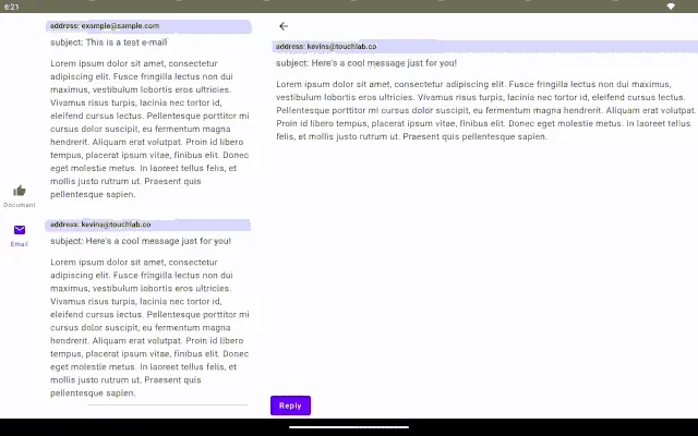
In my example the list details is being used for an e-mail client. The ListPane is for the list of e-mails, the DetailPane shows the contents of the e-mail, and when clicking on “reply” the ExtraPane appears with the option to reply to the e-mail.
Navigation is handled within the pane using rememberListDetailPaneScaffoldNavigator.
val navigator = rememberListDetailPaneScaffoldNavigator<Nothing>()
ListDetailPaneScaffold(
    directive = navigator.scaffoldDirective,
    value = navigator.scaffoldValue,
    listPane = {  ... },
    detailPane = { ... },
    extraPane = { ... },
)
The navigator handles transitions between the layouts and which panes are shown.
Don’t forget that this is to be used with smaller devices as well where only one pane is visible, so you may need to navigate or show panes depending on the device size.
To navigate you call navigateTo similarly to how compose navigation works. The difference is that with the panes you don’t need to define destinations, you can just pass in which pane should be shown.
navigator.navigateTo(ListDetailPaneScaffoldRole.Detail)
navigator.navigateBack()
Here’s how it looks in practice:
 |  |
|---|
Supporting Pane

Now we can look at the supporting pane. SupportingPaneScaffold can be used to show up to three composable panes: mainPane, supportingPane and extraPane.
The API for SupportingPaneScaffold slightly differs between AndroidX and CMP, mostly that the AndroidX API has some extra variables that aren’t in the CMP API.
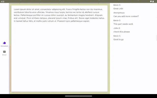
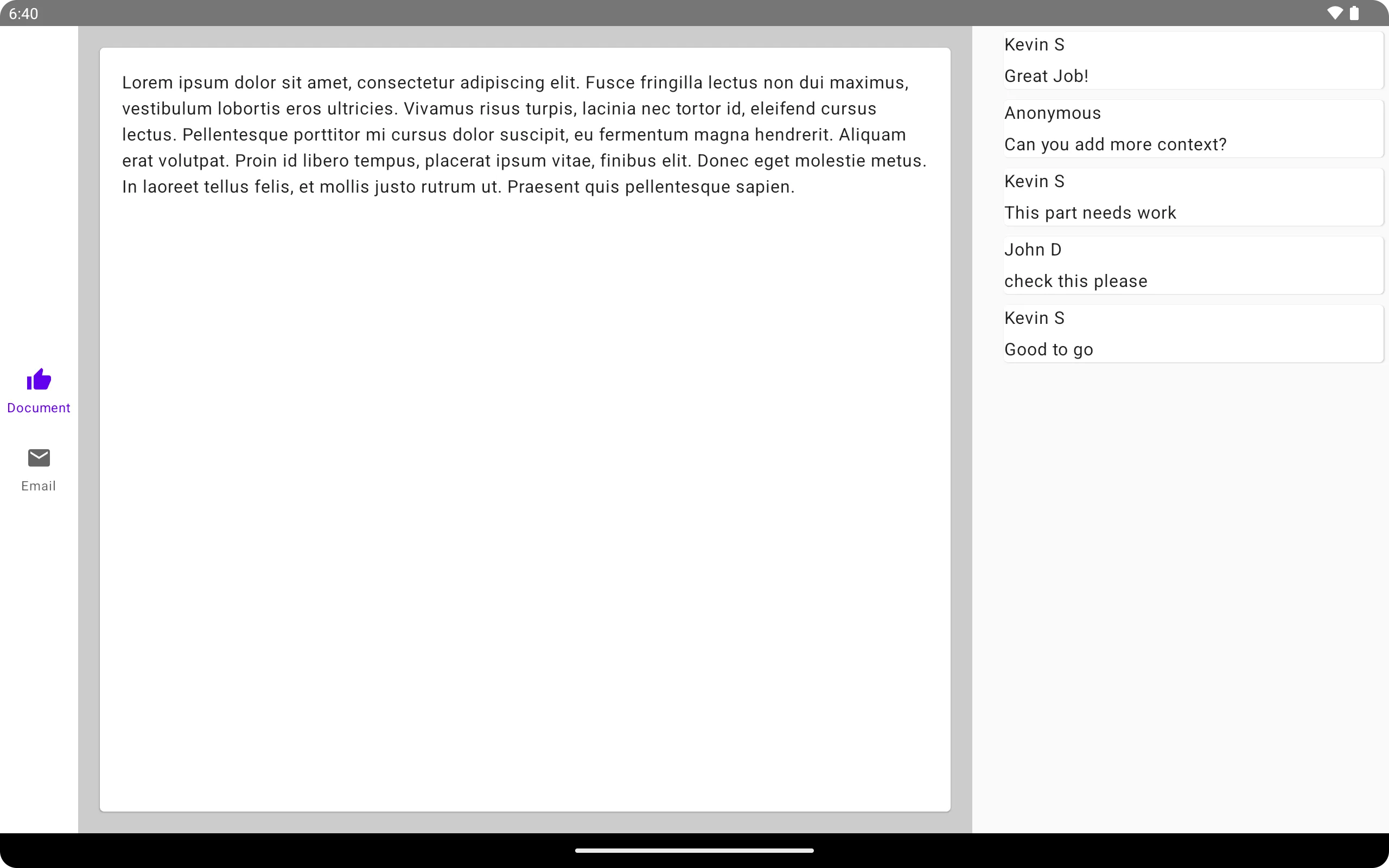
In my example the supporting pane is being used for a document viewer with comments. The mainPane is for the document, the supportingPane shows the comments, and when clicking on a comment the ExtraPane appears with more details of the comments.
Navigation is handled within the pane using rememberSupportingPaneScaffoldNavigator.
val navigator = rememberSupportingPaneScaffoldNavigator<Nothing>()
SupportingPaneScaffold(
    directive = navigator.scaffoldDirective,
    value = navigator.scaffoldValue,
    mainPane = {  ... },
    supportingPane = { ... },
    extraPane = { ... },
)
The navigator handles transitions between the layouts and which panes are shown.
Don’t forget that this is to be used with smaller devices as well where only one pane is visible, so you may need to navigate or show panes depending on the device size.
To navigate you call navigateTo similarly to how compose navigation works. The difference is that with the panes you don’t need to define destinations, you can just pass in which pane should be shown.
navigator.navigateTo(SupportingPaneScaffoldRole.Supporting)
navigator.navigateBack()
Here’s how it looks in practice:
 |  |
|---|
Common Logic
Both canonical layouts are implemented in a similar way, and share some common APIs.
Navigation
Navigation was briefly covered above, but it’s worth mentioning that both list details and supporting panes use a ThreePaneScaffoldNavigator. This navigator takes in two key optional variables:
PaneScaffoldDirective- The sizes and amount of panes to be usedThreePaneScaffoldAdaptStrategies- The strategy for when to hide/show panes
If you want to customize how many panes are visible, their size and when to show them, then you can pass that information in when creating the navigator.
The directive gets passed into both scaffolds, as well as the ThreePaneScaffoldValue, which is the current visibility of each pane. The navigator by default will handle these values.
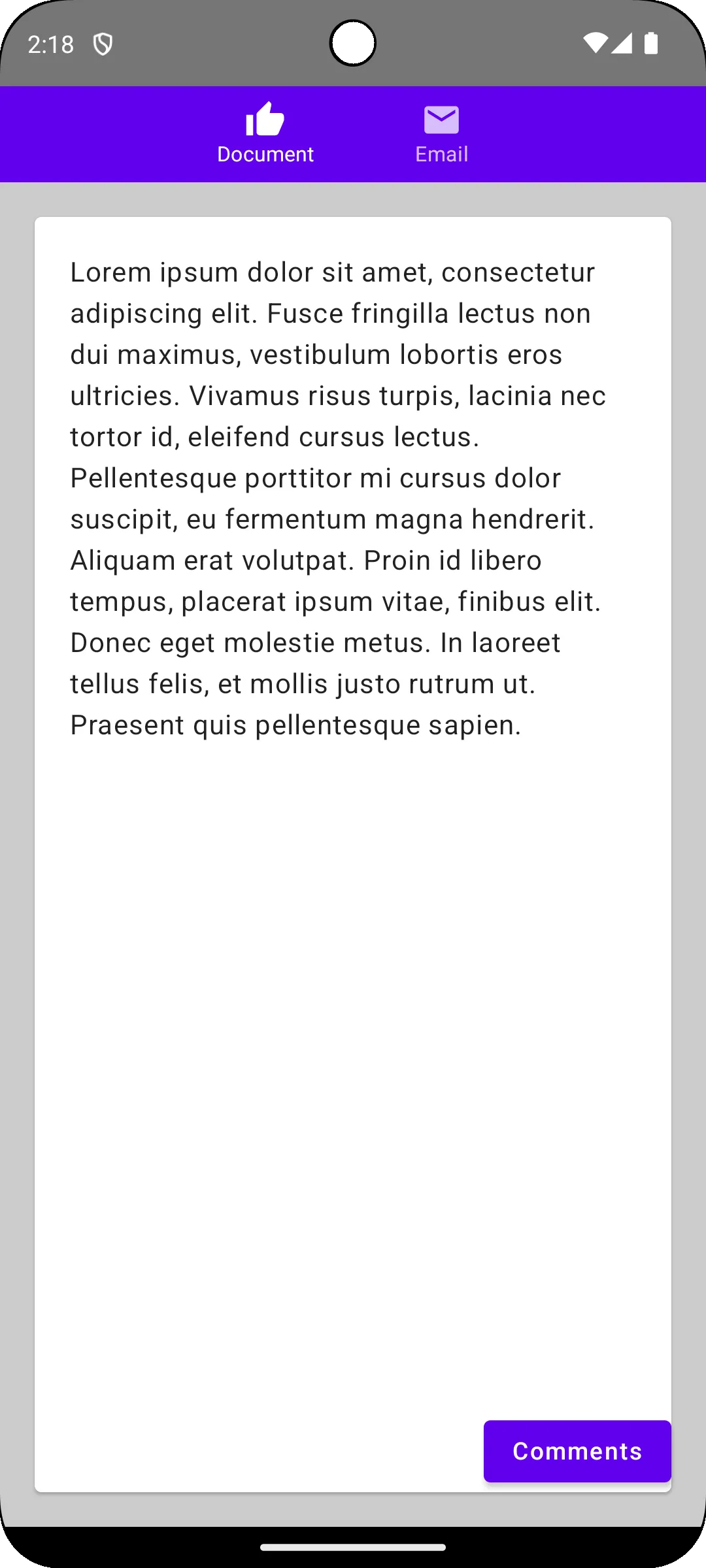
In some cases you may want to have custom logic based on what is and isn’t shown. For example on smaller screens when the second pane isn’t visible you may want a button for navigating to that second pane. For cases like this you can use the navigators ThreePaneScaffoldValue to check for these conditions.
For example we need a way to navigate to comments on a document. We can check the scaffold value:
if (navigator.scaffoldValue.secondary == PaneAdaptedValue.Hidden) {
	Button(onClick = showComments()) { ... }
}
 |  |
|---|
Animated Pane
You may have noticed the sliding animations in some of the gifs, those are created from the AnimatedPane composable also available in the API. It should work without needing any variables, however in some cases you may get some unusual results if you don’t set modifier = Modifier.preferredWidth(WIDTH.dp) for at least one of your panes.
Multiplatform
We’ve gone over how these canonical layouts are implemented in common code, but how well does it work? Well overall adaptive layouts look good in practice.
iOS
 |  | 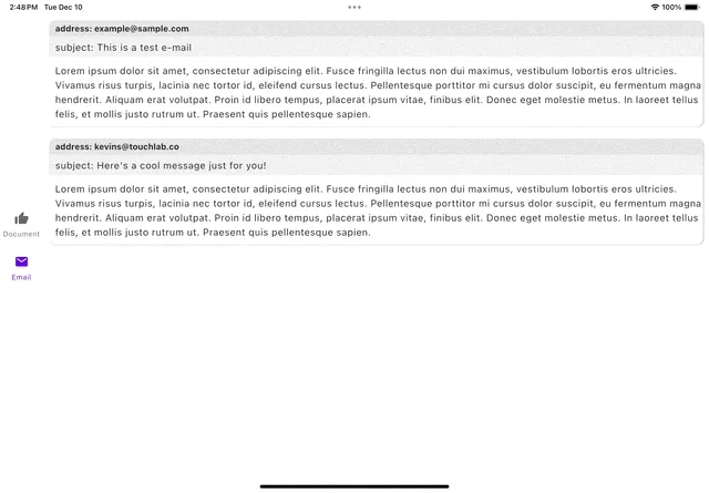 |
|---|
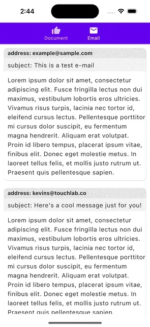
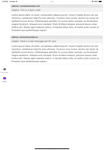
We’ve already shown how it looks in Android, well iOS looks just as good. This shouldn’t be too big of a surprise as they are both mobile platforms and are somewhat stagnant screens, meaning the size of the screen stays the same unless the screen is rotated. There’s not much to say other than it works great and looks just as good on iOS. It seems to be a great substitute for SwiftUIs NavigationSplitView.
Desktop
 Desktop also works surprisingly well, especially considering that the window can be constantly scaled to different sizes. You can see the Navigation changes based on the ratio of the window, and that the panes hide and show appropriately when scaled.
There is one strange thing that happens when scaling though, see if you can spot it.
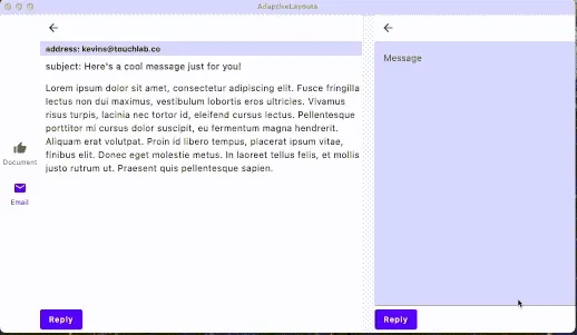 When actively scaling the window it goes from focusing on the extra pane exclusively to showing the main pane when converting to the portrait ratio. This is actually a recomposing issue because of our navigation changes in the beginning. Since we made an if/else condition containing different navigation objects it is recompiling the layout when it changes from one condition to another. If we remove the condition and only show the navigationRail then it will scale appropriately, so the navigation is the problem. If the CMP implementation had the
 NavigationSuiteScaffold this might not be an issue, but as far as I can tell this is not an option at the time of this writing.
Would you recommend?
So would we recommend this layout? Absolutely. It works very well on all platforms, and with the exception of the lack of the NavigationSuiteScaffold it seems to be identical to the existing AndroidX API. Hopefully they will add this option in the future, or make it more obvious if it is available. While it can be tricky at first to think of what panes to show in what configurations, it greatly reduces the amount of work needed to handle different screen sizes and devices.
Diving Deeper
This post covers the basics of getting canonical layouts up and running in a multiplatform sample. For more in-depth examples of how to use these layouts, you can go through googles Adaptability Codelab , the course, or check out the Canonical Layout sample. Additionally you can check out the official docs. While these use the AndroidX APIs they will still cover the same code and design concepts more or less.