· 6 min read Posted by Kevin Schildhorn
Taking a Look at Storytale
In January the Kotlin Foundation announced that a group of developers, lead by WhiteScent and Artem Kobzar, had worked on an exciting project called Storytale: a Gradle Plugin and runtime library that generates a UI Component Gallery for your Composables.
Inspired by Storybook for React, this project lets you preview your Composables in different configurations, completely isolated from your project. This works similarly to Figma Component Playgrounds, where you can toggle states and variables to update the preview of your components. The preview can be loaded on all platforms, so you can play around with your components on desktop, mobile, and web.
This project is very new (The version number is v0.0.1+dev9!) so there are some caveats to using it, but it’s still a useful tool to previewing your UI Components. So let’s take a look at how it works.
Overview
The GitHub Documentation goes over how Storytale is setup, but what is it doing behind the scenes?
First, you generate stories like so:
val `PrimaryButton default state` by story {
   val enabled by parameter(true)
   PrimaryButton(onClick = {}, enabled = enabled)
}
In stories you are defining parameters you can interact with in the UI and your Composable you’re previewing. Then you run a gradle command that generates the UI for previewing stories (You can see an example here).
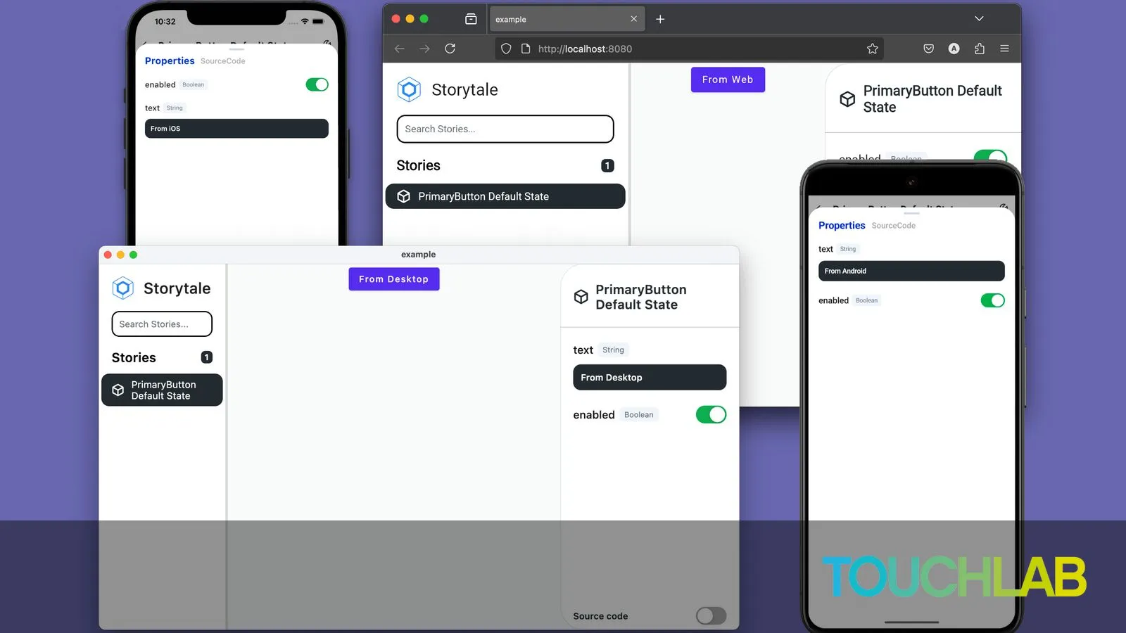
UI
 The UI is broken up into three sections: the stories column, the preview and the parameters column.
Stories Column
The stories column lists all the stories you’ve created in your project, separated by the file you’ve added them to. For example val PrimaryButton by story is located in my file PrimaryButton_MyFile.story.kt.
You can search the stories using the search bar, which is a nice feature, however you cannot search for file names. This would be helpful in cases where maybe you have all of your stories for one particular component in one file. It would be nice to be able to collapse a files stories if you’re in a scenario where you have a lot of stories, but it’s still a very early version.
Parameters Column
The parameters column is where you toggle and edit parameters to preview on the composable, or you can view the Source Code of your story to see exactly what’s going on.
Preview
The preview is the main focus, as it showcases your component and handles parameter changes. The story you define is actually a standard Composable that shows what you’ve declared in your story.
inline fun story(
    code: String = "",
    group: String = "",
    crossinline content: @Composable Story.() -> Unit,
)
What this means is a preview supports visuals like animations and progress spinners. This also means you can have as many components as you want in one story, for example if you want to preview multiple configurations in one location.
 One downside is that currently there is no way to configure the background of the frame, but you can get around that by customizing the composable you pass in.
Downsides
As I mentioned earlier, this is a very new project so there were some issues I ran into, and some features that would be nice to have:
Crashes and Compatibility
When trying to add Storytale to a new project I ran into issues with kotlin compatibility, and crashes when loading stories on Android and iOS. It’s possible my environment wasn’t setup correctly, but just following the instructions didn’t work for me. What worked best for me was to download the source code and publishing the newest version to maven local or using their example environment for the best results.
Choosing your Emulator
It seems that at this point you cannot choose which emulator / simulator to use when generating stories. Again it’s possible the option was there and I was unable to find it, however none of the documentation helped me here and Storytale kept trying to run on my Wear emulator.
Parameter Support
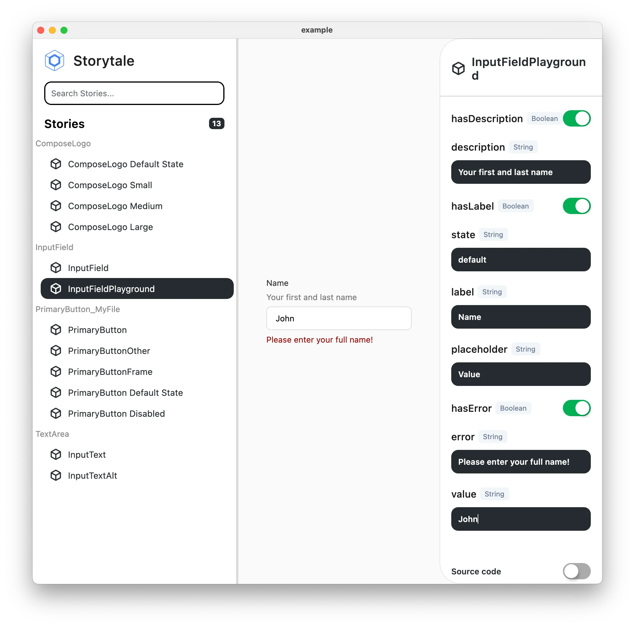
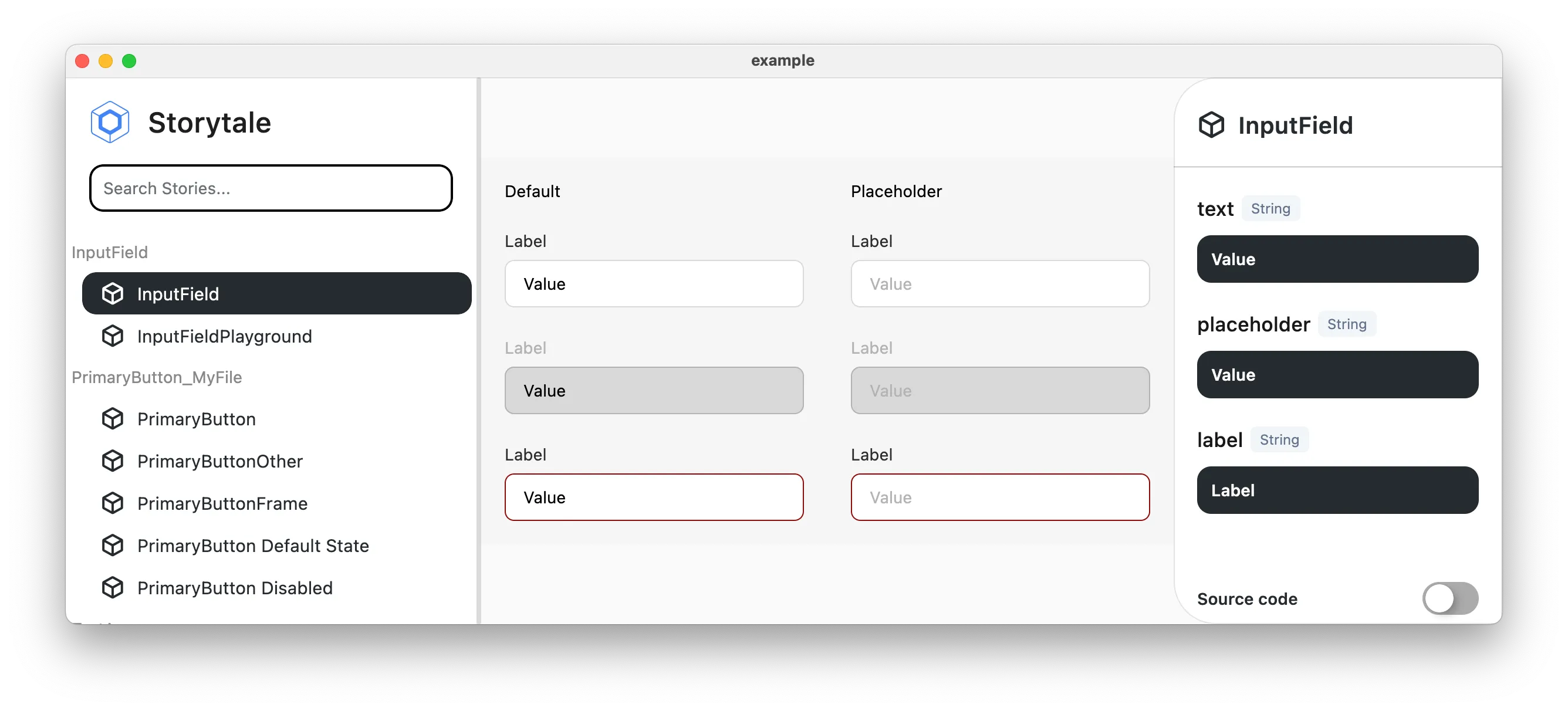
Currently Stories only support parameters of primitive types. This means no colors, no data classes, and most surprisingly no enum support. So if you have states defined by enums you cannot use them as parameters. You can still pass these types to the composable in stories, they just can’t be parameters. One way to get around it is to have multiple instances of your composable and directly pass in different variables for each one, similar to how I previewed InputField above.
Design Systems
Even with some issues Storytale is an interesting and helpful tool for previewing your UI, and another stepping stone in the bridge between code and design.
Design Systems have become more and more prevalent in development over the years, and is a helpful way to organize your apps UI/UX. Typically in projects designers create these components in Figma or similar software, and developers try their best to match them. Then if a designer wants to see the UI in action they need to download the app or look at screenshots, neither of which is easy or really shows the full extent of the Components. There has always been a disconnect between developers and designers, which developers have tried to solve with solutions like Relay(which will unfortunately sunset later this year).
Storytale provides a good way to help bridge the two sides by giving designers a UI preview playground of their components written in the actual implementation. You can see that the UI even matches the Figma playground fairly closely.
| Figma | Storytale |
|---|---|
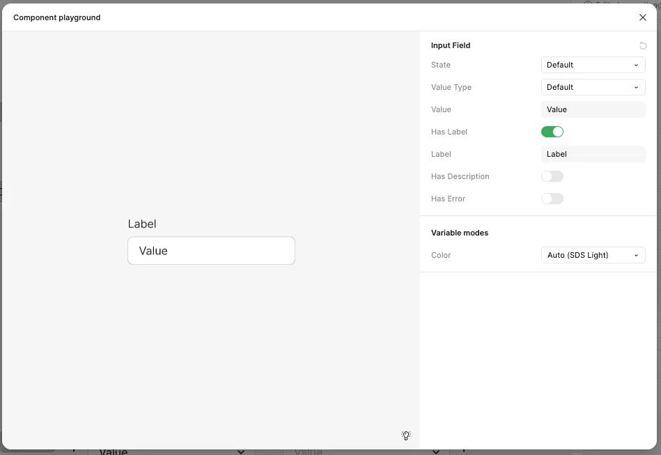 | 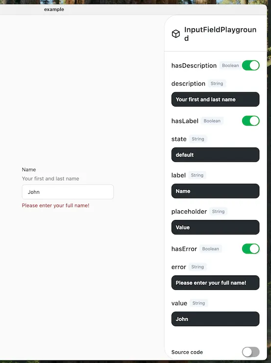 |
To test out Storytale I used Figmas Simple Design System as a reference in order to see how both sides compared, and as you can tell from the screenshots.
| Figma | Storytale |
|---|---|
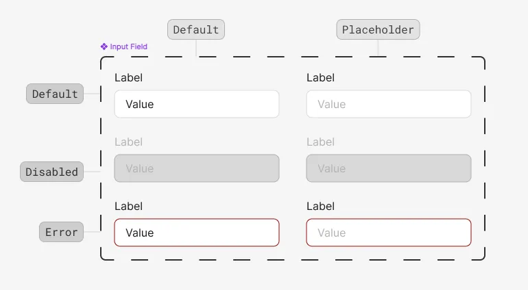 | |
It was great to see that it was easy to replicate the Figma designs and be able to play around with components the same way I would in Figma.
Conclusion
So that’s Storytale, another potential tool in your arsenal for creating a great UX. It’s in it’s very early stages, and there’s no guarantees of updates, but even in its current state it provides a great way to help bridge the gap between developers and designers. Hopefully it will continue to get updates and improve to be a more robust and well rounded tool to design your Components using Compose.